


Gillette Prep Packaging Concepts






About This Project
As the Gillette Mega G deployment begins across adjacencies and mediums we must ensure the expression of the brand is consistent across all materials. We have discovered that some of these materials are in, or about to be in, process. Client required immediate need to update and publish the Mega G style for agency partners to ensure a holistic, unifying Mega G presence.
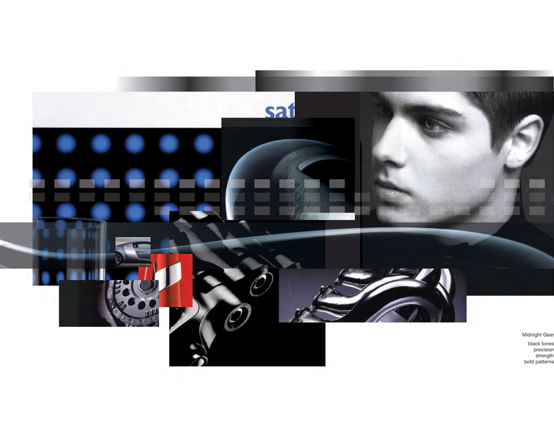
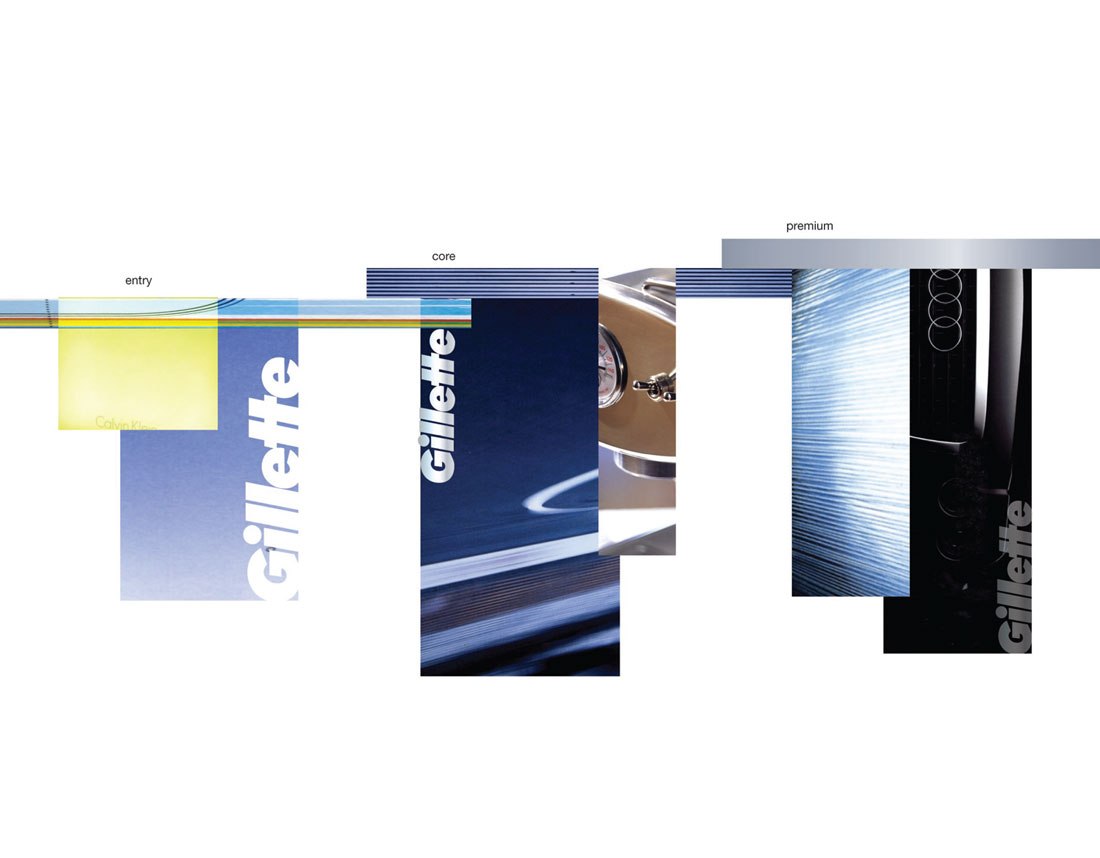
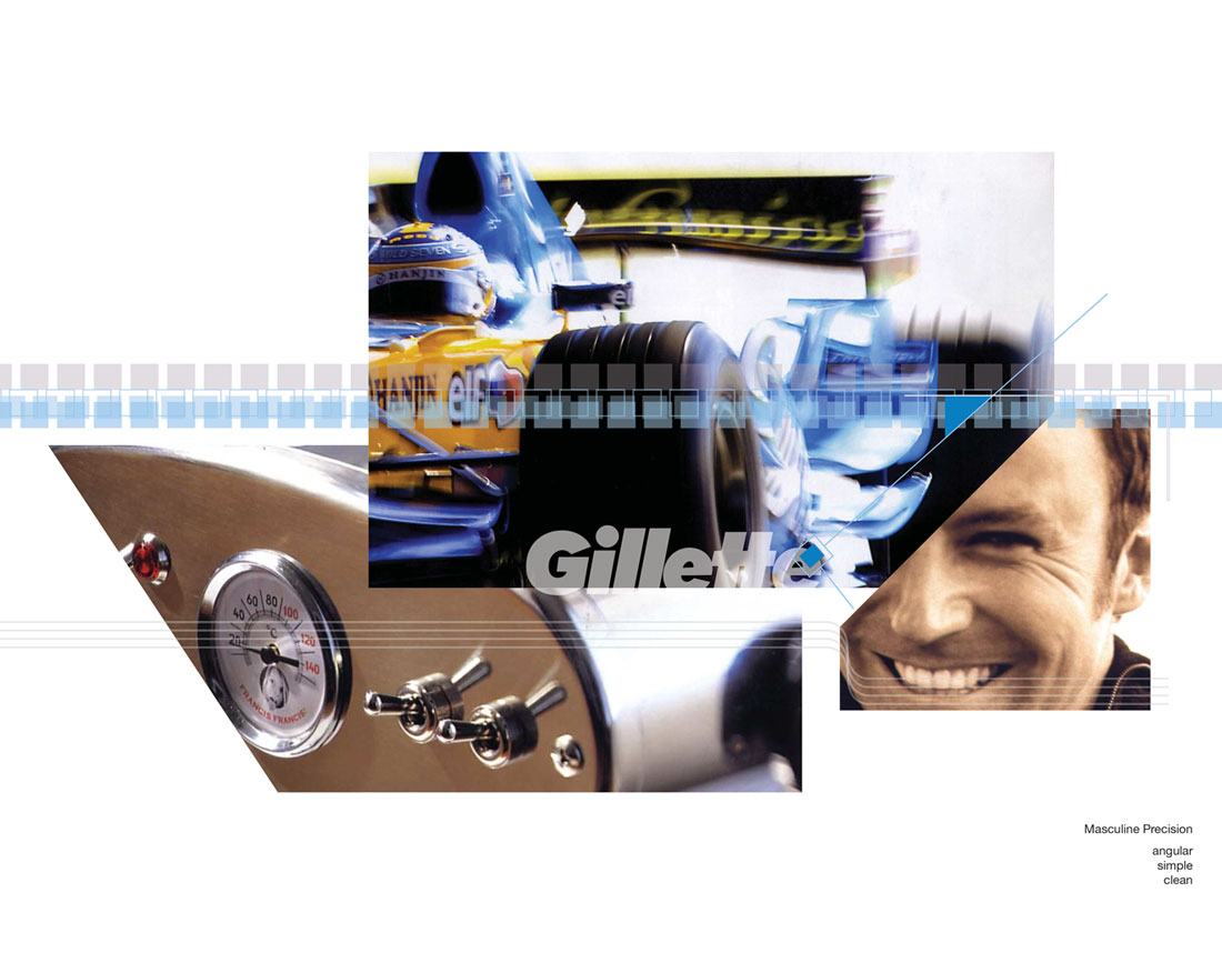
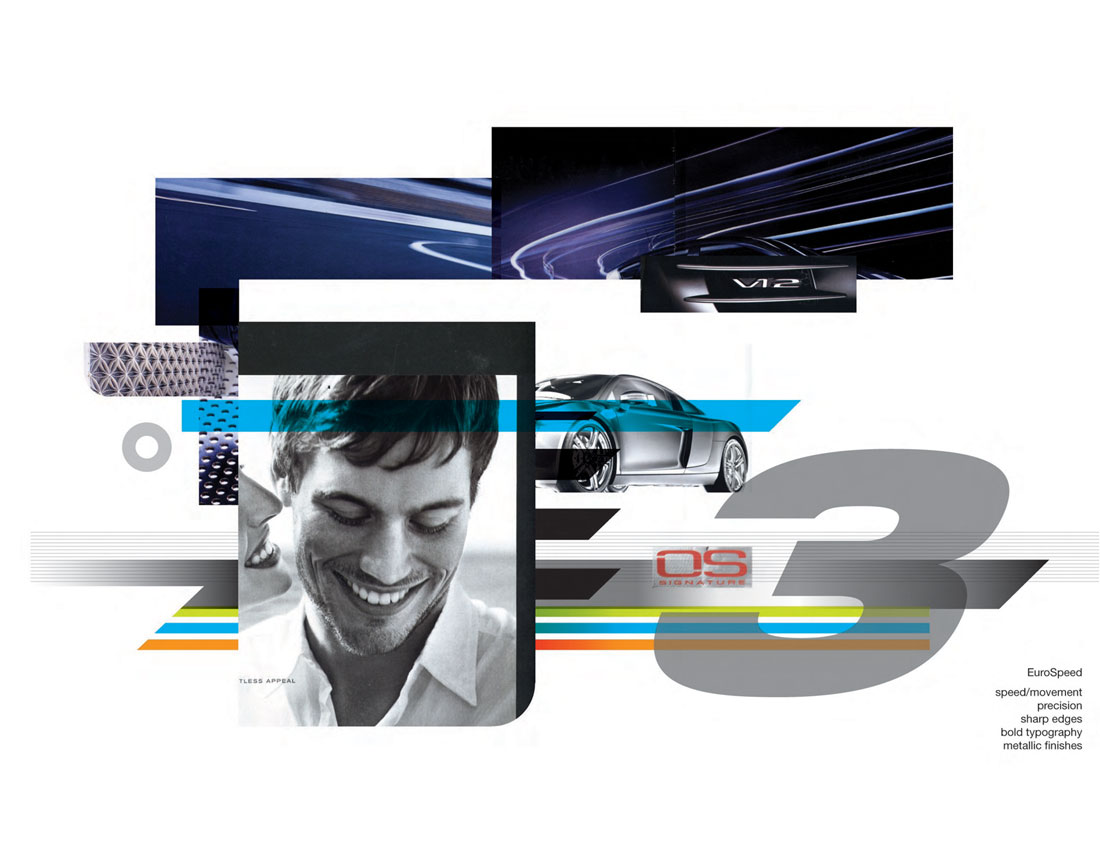
- Explore overall look, tone, and feel across mood boards
- Copy refinements and priority of communication
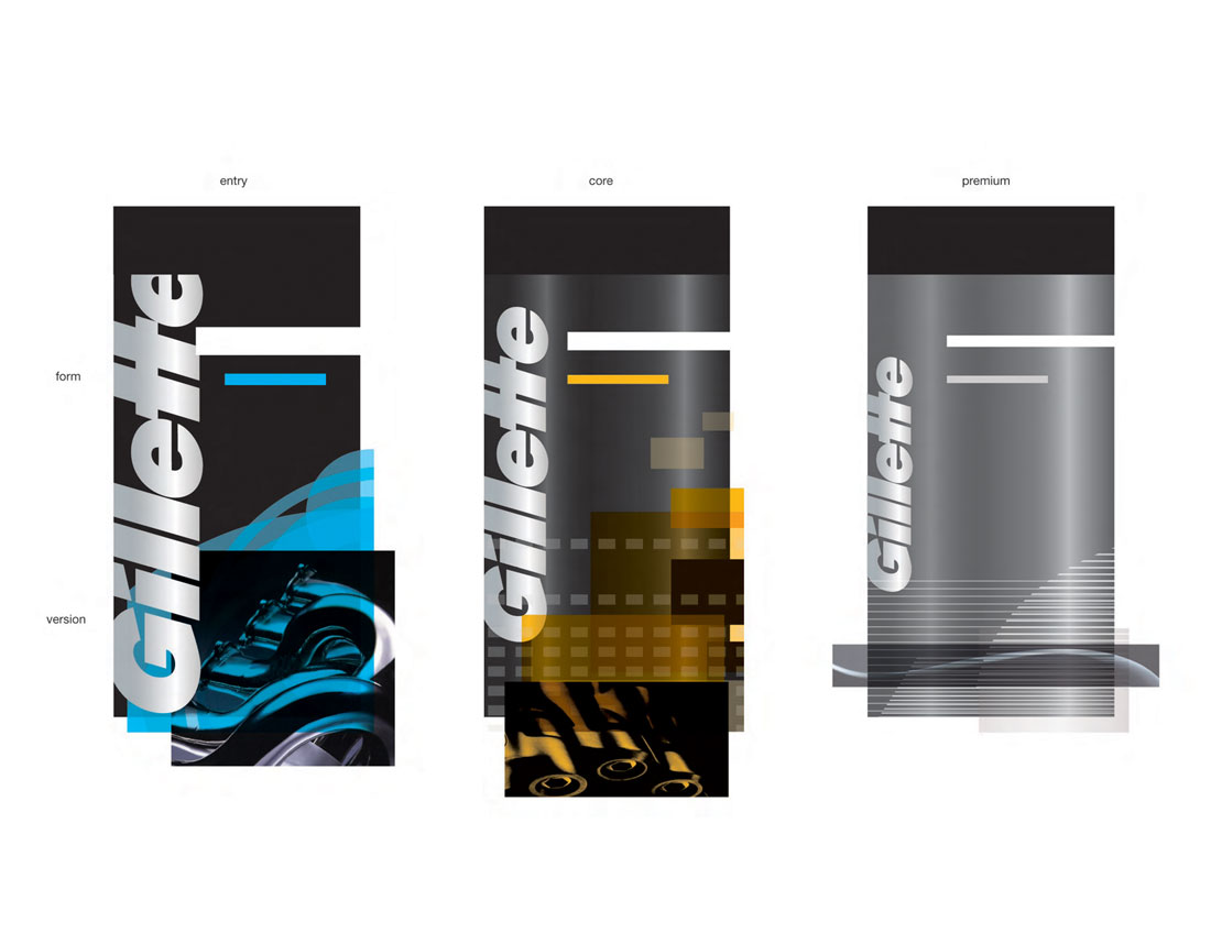
- Patterns
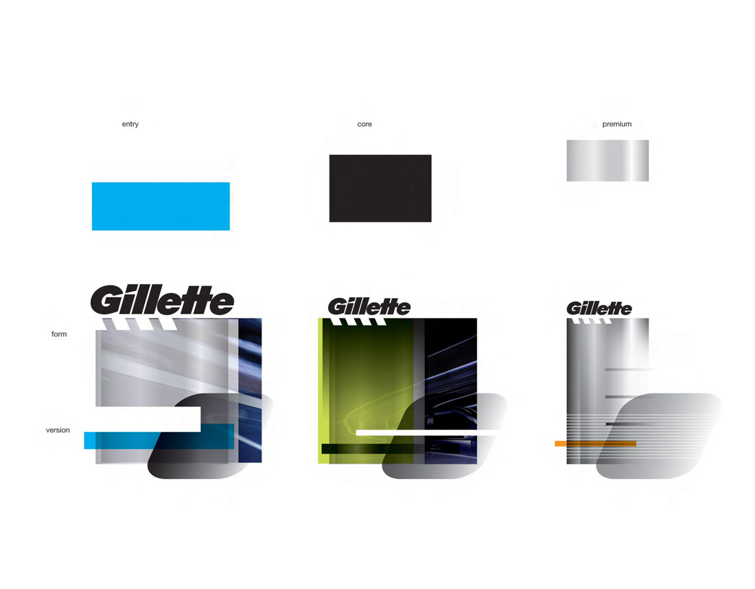
- Brandmark, wordmark and Mega G usage
- Color usage and proportion
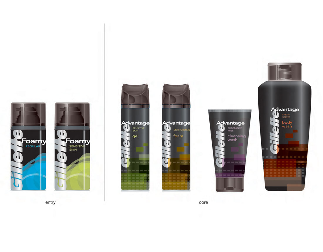
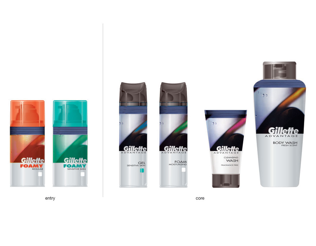
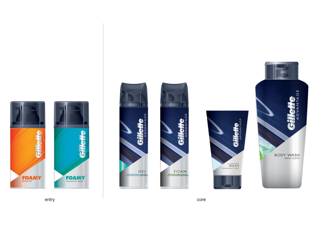
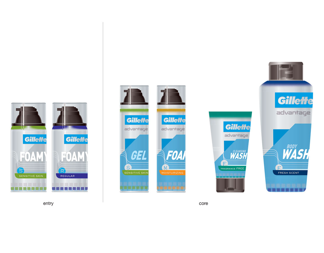
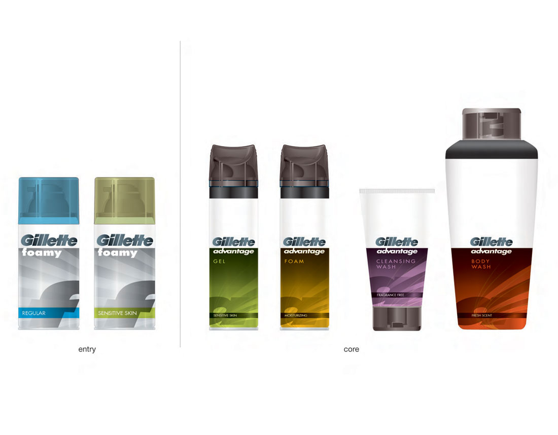
- Application of graphics elements to package (includes rendered pack images)
- Packaging examples
- Vertical and horizontal examples of graphic elements for POP and printed
- material application
Date
20 November