


Gillette Style Guide







About This Project
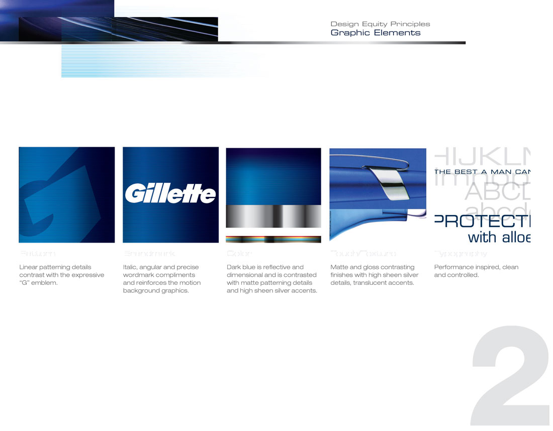
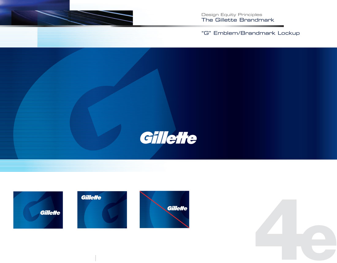
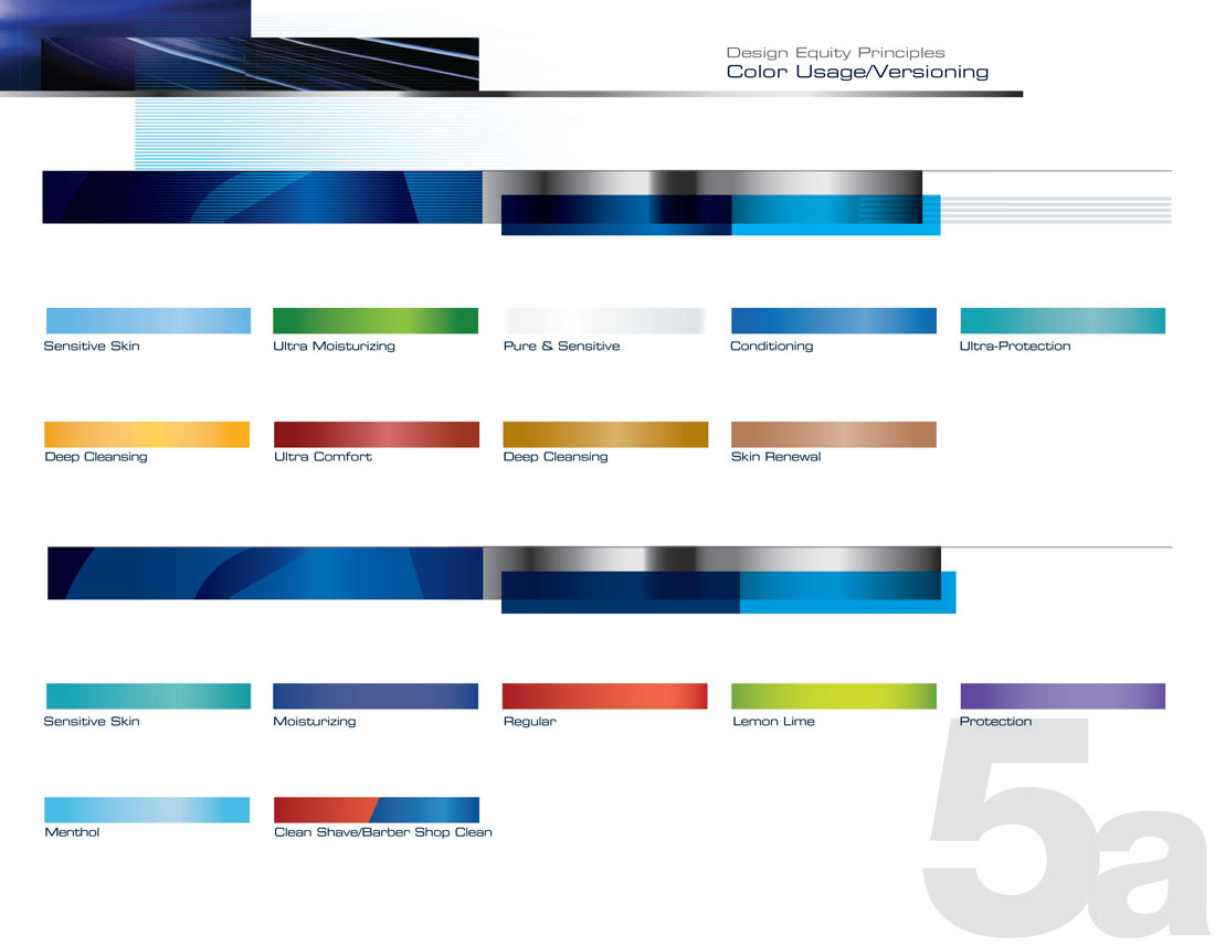
As the Gillette Mega G deployment began across adjacencies and mediums. Objective was to ensure the expression of the brand maintained consistency across all materials by developing a “Mega-G” brand style guide. Ensuring a holistic, unifying Mega G presence throughout marketing campaigns and key equity assets.
Key Equity Asset Overview
- Overall look, tone, and feel across all branding vehicles
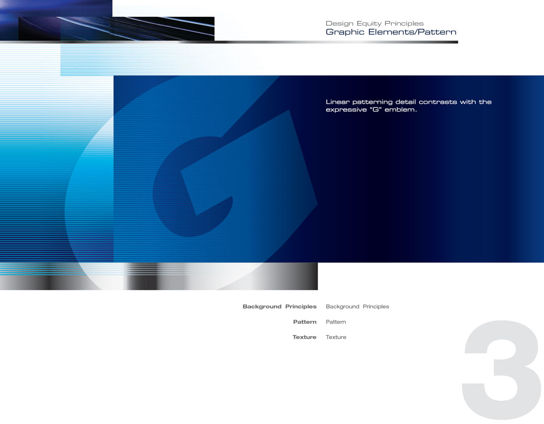
- Patterns and secondary equity assets
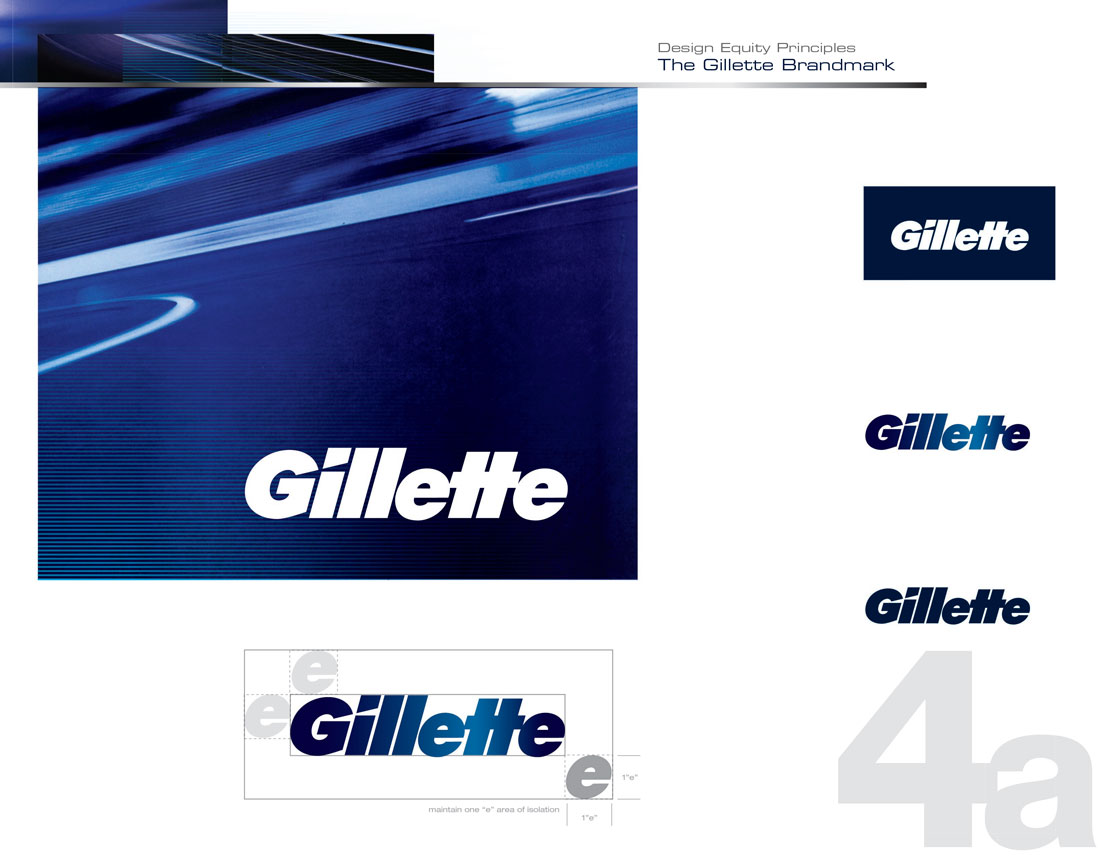
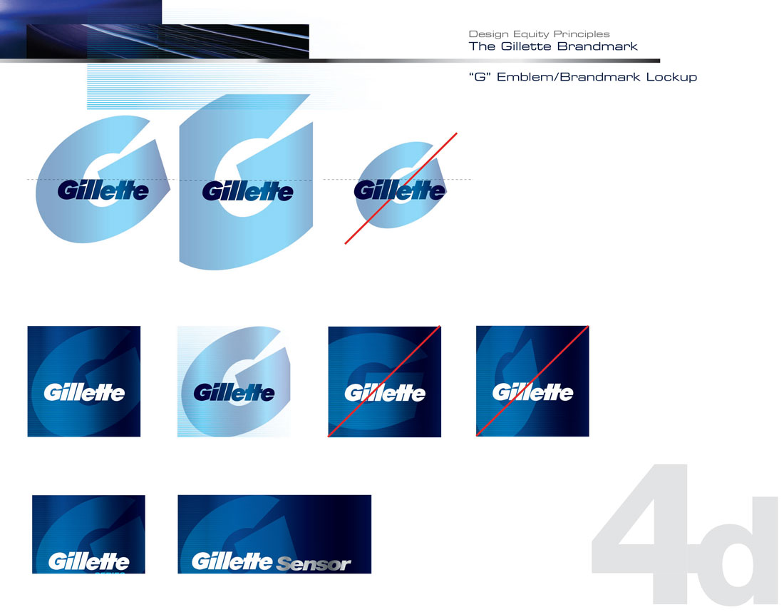
- Brandmark, workmark, and Mega-G usage
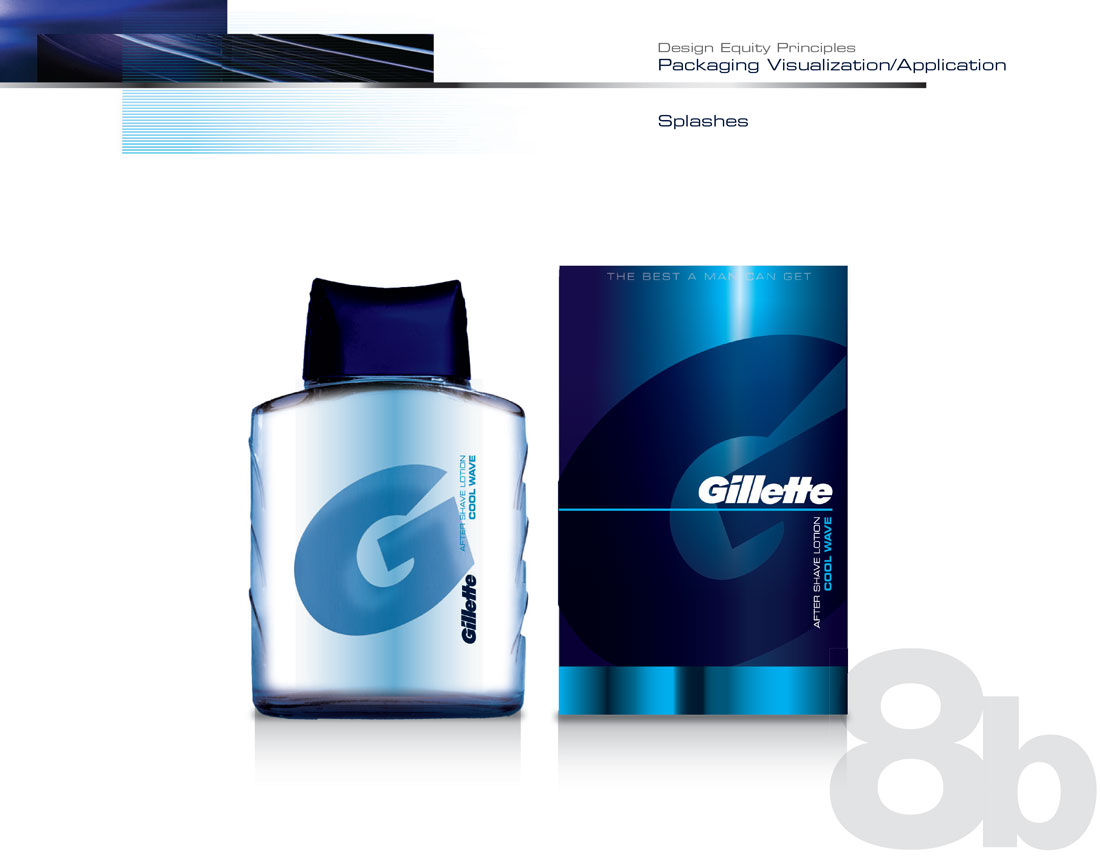
- Application of graphic elements to package
- Packaging examples
- Vertical and horizontal examples of graphic elements for POP and printed materials