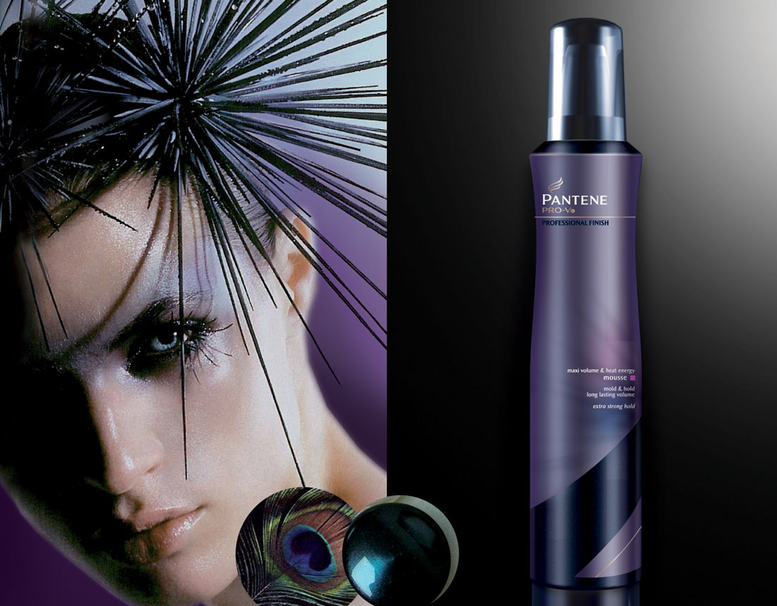
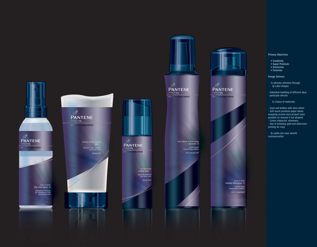
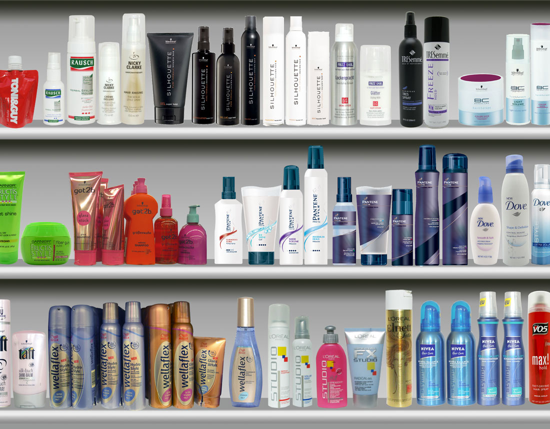
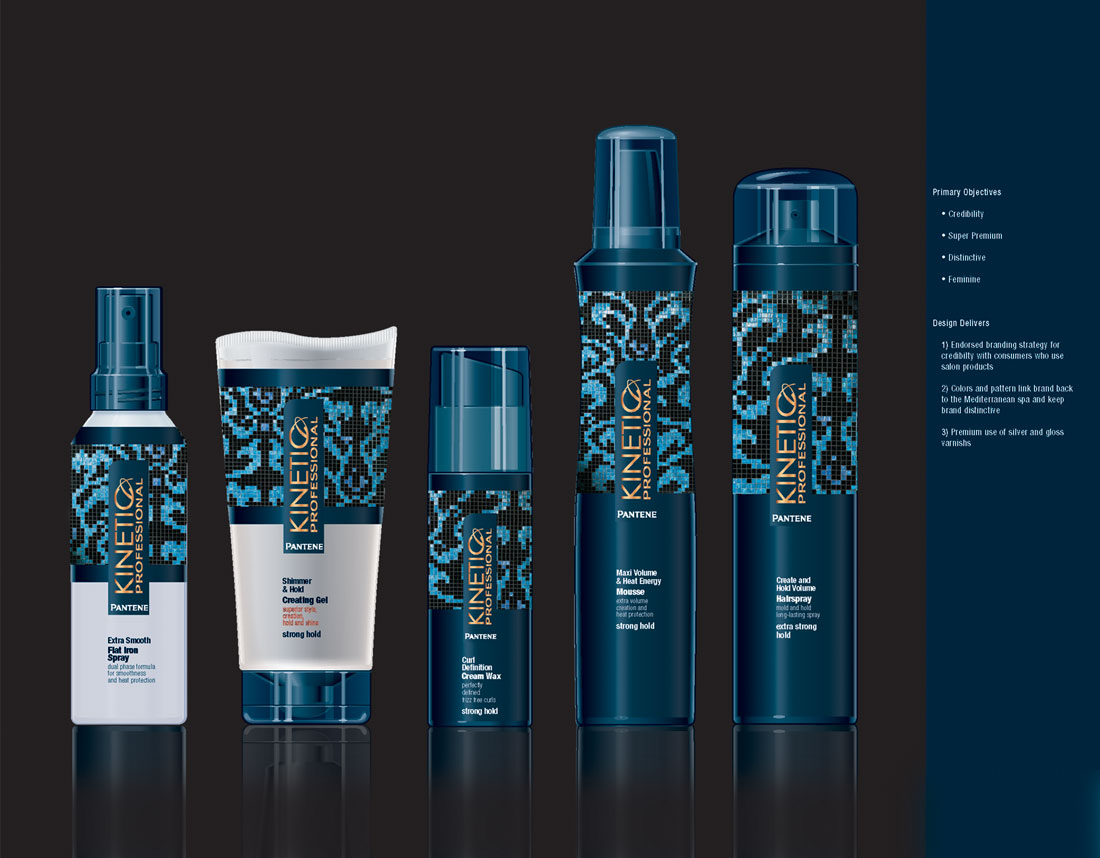
Pantene Pro-Finish Styling Concepts
About This Project
Pantene Pro-V Style
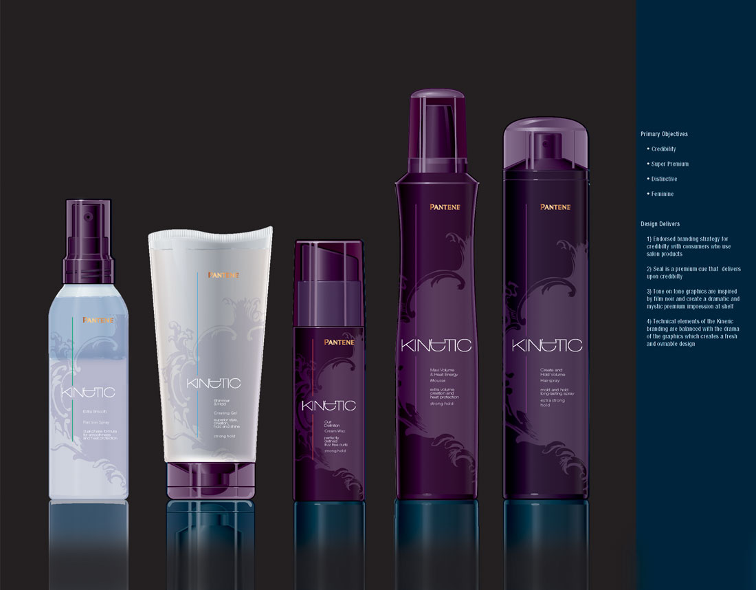
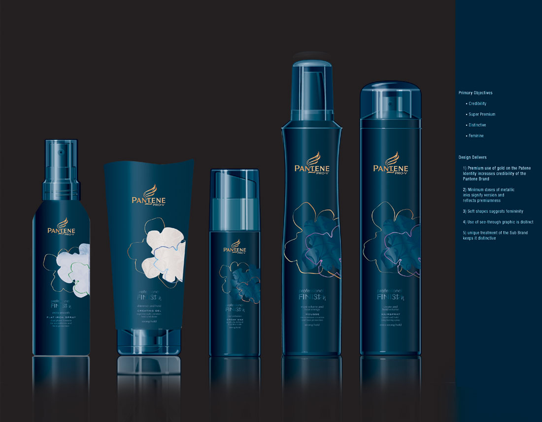
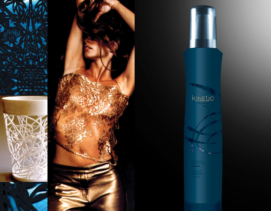
Client wanted to explore a new styling product line that falls under the Pantene Pro-V product family. Client had key specific goals throughout the initiative, explore additional identity options outside of the vertical logo. Eliminate style from the logo but must keep Pro-V. Client requires that the Shirra identity must be locked up with Pantene and must communicate authority, luxury, and credibility.
Professional Finish
Client is open to exploring the prominence of Prof Finish within the design – it is not mandated that it be locked up with the identity. Cans & Plastic bottle colors Open to explore new bottle colors, but need to keep cobalt in the mix. Client highly specifies the design must look feminine and rendered examples of the finishes must be articulated.
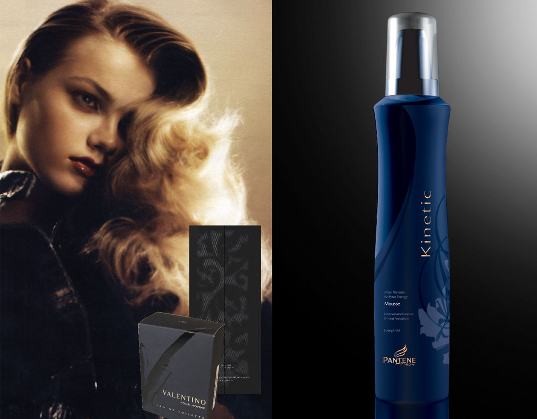
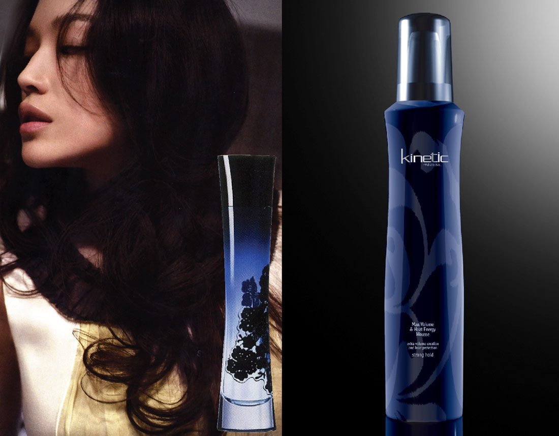
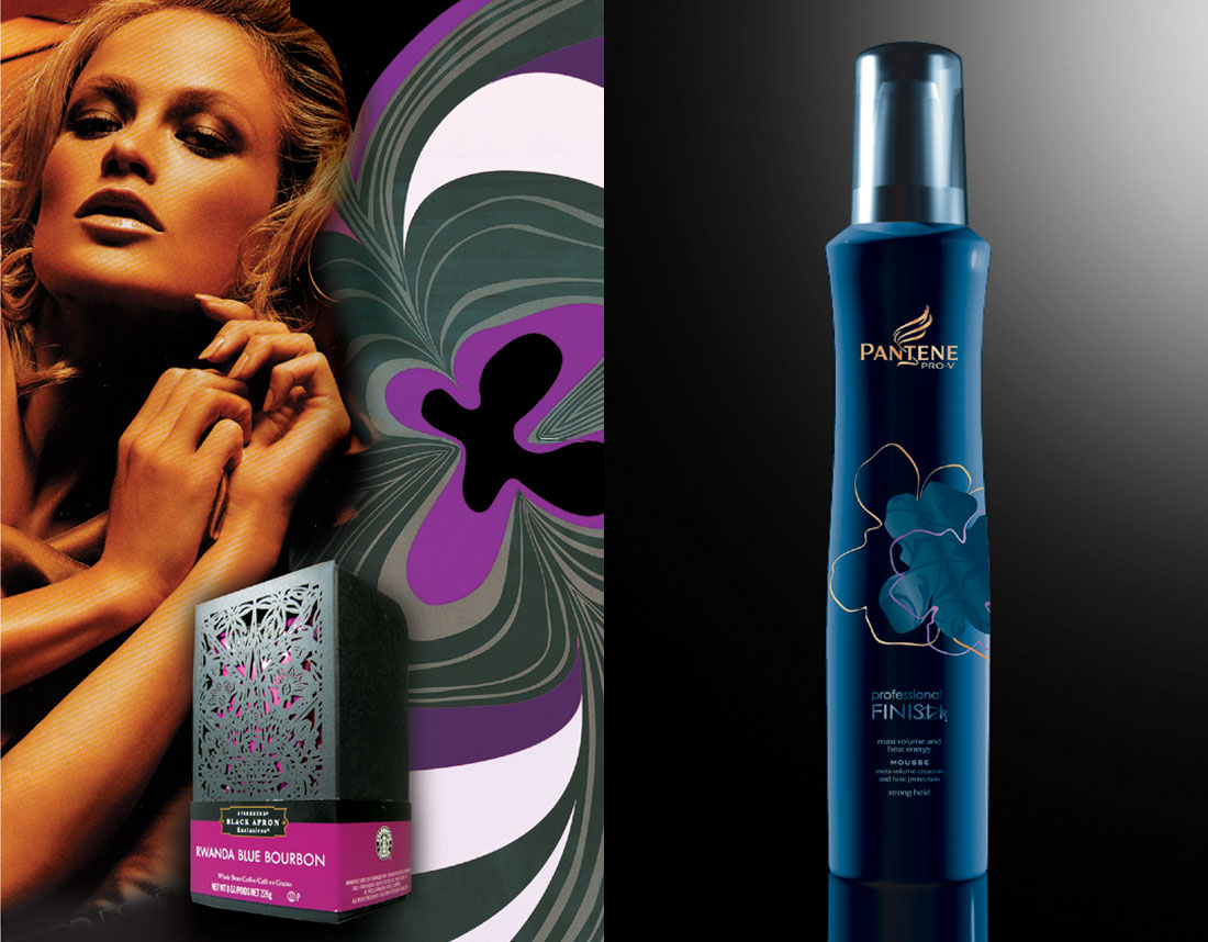
Client referenced the following inspirational ideas. Please note that the following products have been shared and kept as references during internal review:
- Shiseido cream Future Solution (mica effect)
- Dior Style Liner (mica effect with blue shimmer on blue background – very well perceived)
- Dior Addict perfume (combination of blue & gold + premium design which does not deliver femininity, yet well perceived)
Execution & graphics mandatories
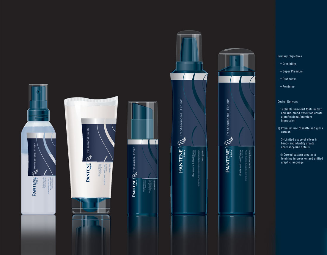
- Need to explore matte and gloss finishes, combined
- Need to explore a bronze-shaded Shirra
- Need to keep as much negative space as possible on pack – premium build
Success Criteria
- Credibility
- Premium/Luxury/Salon feel – simple and minimal is key
- Validate the price point
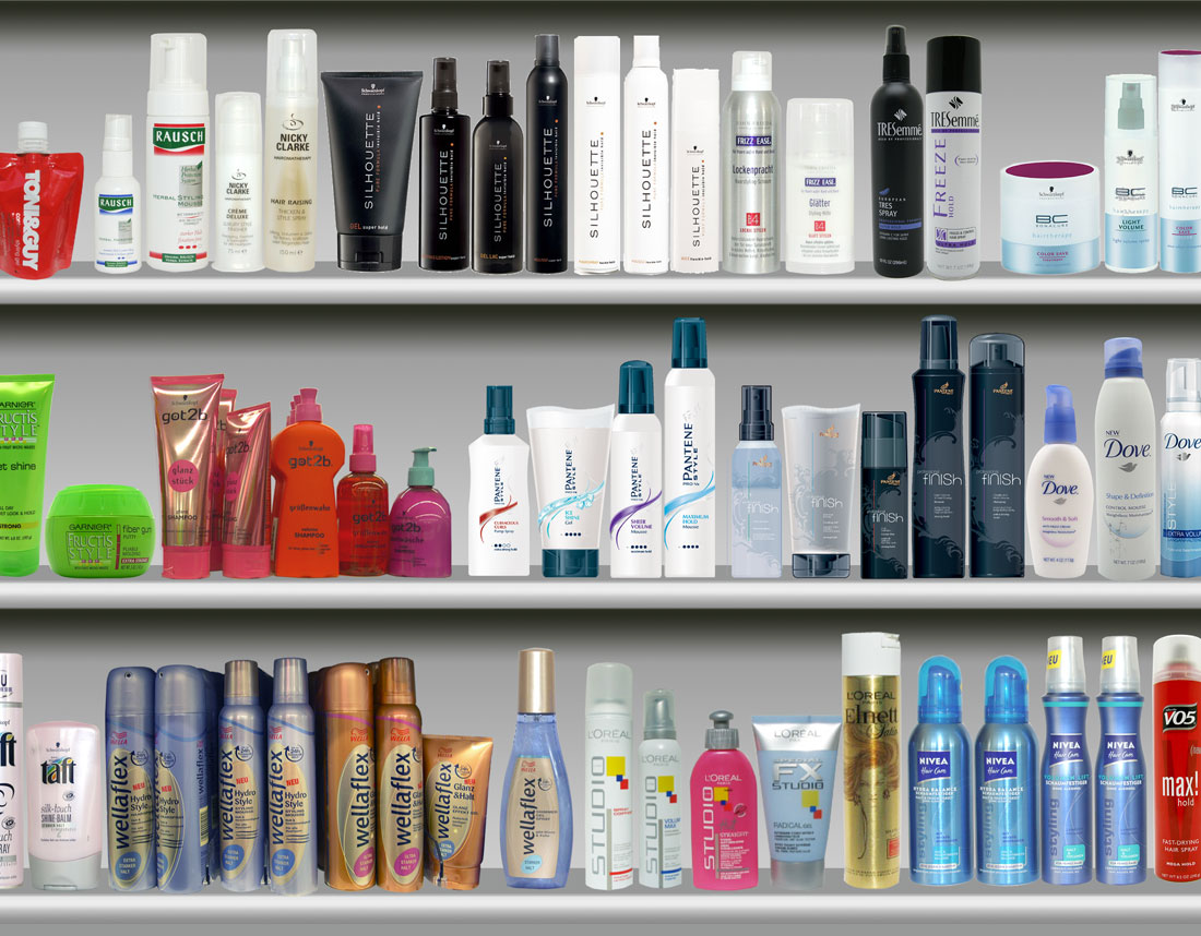
- Distinctive
- Feminine
- Strong typography
Works with Shelf Ready Trays (please consider 20mm as height since client has not been able to come back with precise dimension.
Category
Branding, Identity, Packaging